flyer Project
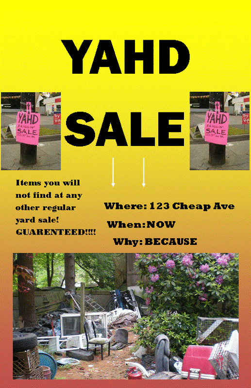
This project, assigned by our teacher, Mr. Adams, was designed to help us students further understand the concepts and principles of balance, emphasis, and line weight. This flyer could have been about any topic of our choosing, so as long as those three elements were included somewhere in the flyer. As you can see, the principle of balance is most represented by the two images to the left and to the right of the "YAHD SALE" text at the top. It can also be seen with the color used. In the two photos as described, they are both pink, this flow of color continues to the bottom of the page, where there is a plant with pink flowers. The emphasis can be seen easily at the top of the page at the title. The large, bold print with a yellow solid background really emphasizes the "YAHD SALE". Line weight can be seen as well as emphasis at the 2 white arrows at the center of the page pointing downward to the photo with a background of yellow. This project did not take a very long time at all, but I learned about important principle such as line weight, emphasis, and balance. If we were to do this project again, one thing we might want to change is our style. We should do a formal, professional flyer advertising an actual, real, event.
Brochure Project

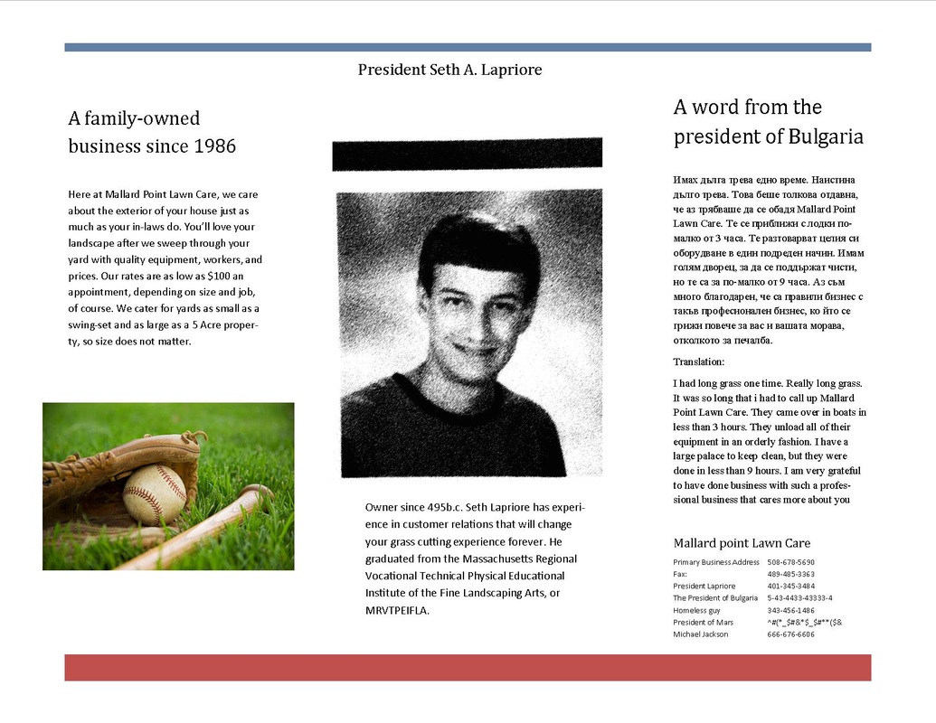
In this project we created a brochure that Mr. Adams assigned to us to test our knowledge of making them. We were not familiar with this new layout before we started this project, so it was all basically trial and error. This project was meant to kickstart the Thayer Street brochure project and get us used to the layout. Included in this brochure was a message from the president of Bulgaria, a short biography on the president of the company, Seth A. Lapriore, and a description on the company on the inside cover. The company's title was Mallard Point Lawn Care, and it took care of peoples lawns and landscapes. After this project, i learned the brochure layout and how to use the folding machine. It was a successful project.
